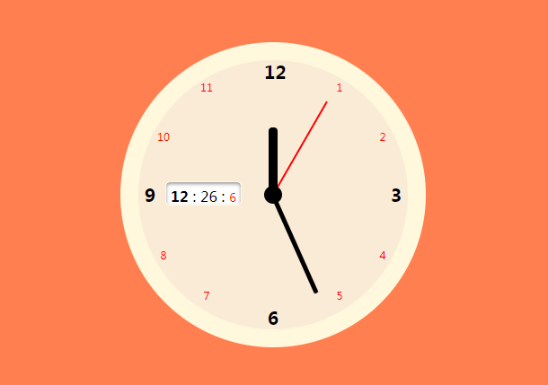
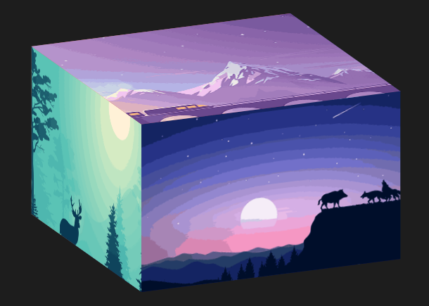
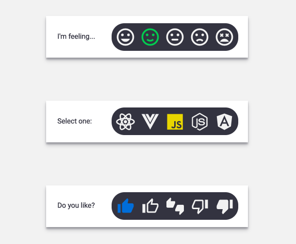
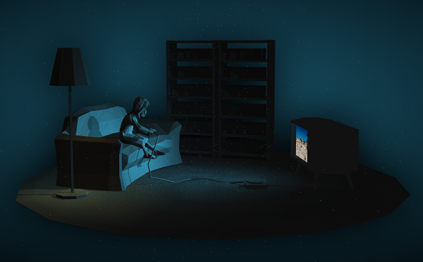
Today we want to bring another beautiful looking pure CSS3 switch button animation that simulates a light switch, and the background of the button changes when switching between on and off, which looks very good.
Advertisement
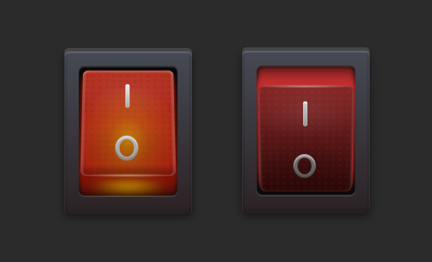
<label class="button">
  <input type="checkbox" checked>
  <span class="hole">
    <span class="switch">
      <span class="one"></span>
      <span class="zero"></span>
    </span>
  </span>
</label>
.button .switch:before {
  content: "";
  position: absolute;
  top: -2px;
  left: 5px;
  width: 122px;
  height: 5px;
  background-image: radial-gradient(ellipse at center, rgba(255, 255, 255, 0.4) 0%, transparent 80%);
}
.button .switch .one {
  position: absolute;
  top: 24px;
  left: calc(47%);
  display: block;
  width: 6px;
  height: 40px;
  background-image: -webkit-gradient(linear, left top, left bottom, from(#ccc), to(#999));
  background-image: linear-gradient(to bottom, #ccc 0%, #999 100%);
  -webkit-box-shadow: 0 2px 1px white inset;
          box-shadow: 0 2px 1px white inset;
  border-radius: 4px;
}
.button .switch .zero {
  position: absolute;
  bottom: 24px;
  left: calc(36%);
  display: block;
  width: 32px;
  height: 40px;
  -webkit-box-shadow: 0 4px 2px rgba(255, 255, 255, 0.5) inset, 0 -4px 2px rgba(0, 0, 0, 0.2) inset, 0 0 0 6px #666 inset;
          box-shadow: 0 4px 2px rgba(255, 255, 255, 0.5) inset, 0 -4px 2px rgba(0, 0, 0, 0.2) inset, 0 0 0 6px #666 inset;
  border-radius: 50%;
}
Advertisement