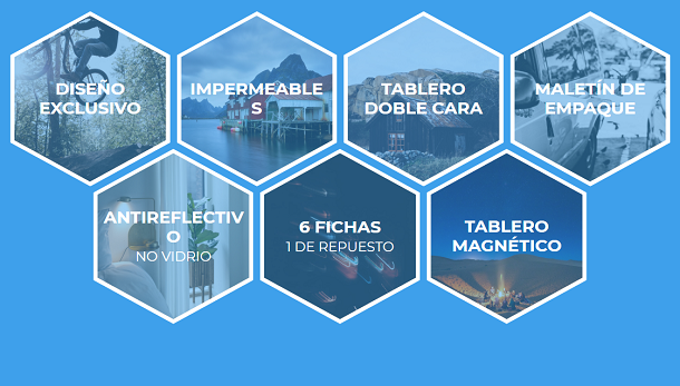
Flex layout is currently very widely used, and it is more flexible and convenient than the traditional box model. This time we bring you a typical example of Flex-based layout. It is a responsive honeycomb layout based on Flexbox. We can place pictures in this honeycomb layout so that we can make a creative photo wall.
Advertisement
<div class="tree-wrap">
			<div class="tree">
				<span></span>
				<span></span>
				<span></span>
				<span></span>
			</div>
		</div>
		<div class="windmill-pole-wrap">
			<div class="windmill-pole"></div>
		</div>
		<div class="windmill-pole-ellipses">
			<div class="windmill-pole-ellipses-wrapper">
				<div class="windmill-pole-ellipses-wrap">
					<div class="windmill-pole-ellipses-center"></div>
					<div class="ellipses">
						<span></span>
						<span></span>
						<span></span>
					</div>
				</div>
			</div>
		</div>
body{
	width: 100%;
	display: block;
	overflow-x: hidden;
	background: #fff;
	font-family: 'Poppins', sans-serif;
}
.switch-wrap {
	position: relative;
	font-size: 17px;
	color: #212121;
	font-weight: 600;
	letter-spacing: 1px;
	text-align: center;
	margin: 0 auto;
	margin-top: 30px;
	-webkit-transition: all 500ms linear;
	transition: all 500ms linear;
}
.switch-wrap span {
	font-size: 14px;
	color: #000;
	font-weight: 500;
	letter-spacing: 0;
}
#switch,
#circle {
	height: 31px;
	cursor: pointer;
	border: 2px solid #000;
	-webkit-transition: all 0.4s cubic-bezier(0.54, 1.6, 0.5, 1);
		transition: all 0.4s cubic-bezier(0.54, 1.6, 0.5, 1);
}
#switch {
	width: 60px;
	margin: 0 auto;
	border-radius: 27px;
	position: relative;
	display: block;
	text-align: center;
	margin: 0 auto;
    transform: translateY(10px);
}
$("#switch").on('click', function () {
		if ($("body").hasClass("slow-wind")) {
			$("body").removeClass("slow-wind");
			$("#switch").removeClass("switched");
		}
		else {
			$("body").addClass("slow-wind");
			$("#switch").addClass("switched");

		}
	});
Advertisement