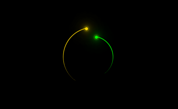
Recently, we just shared a hexagonal loading animation implemented by pure CSS3. This idea of using geometric graphics to achieve Loading animation is still good. What we want to share this time is also a Loading animation based on pure CSS3, which consists of 2 luminous lines that rotate in reverse. This luminous animation looks even more beautiful on a black background.
Advertisement
<div class="loader">
	<div class="face">
		<div class="circle"></div>
	</div>
	<div class="face">
		<div class="circle"></div>
	</div>
</div>
body {
	margin: 0;
	height: 100vh;
	align-items: center;
	justify-content: center;
	background-color: black;
}

.loader {
    width: 20em;
    height: 20em;
    font-size: 10px;
    position: relative;
    display: flex;
    align-items: center;
    justify-content: center;
	margin:100px auto;
}

.loader .face {
    position: absolute;
    border-radius: 50%;
    border-style: solid;
    animation: animate 3s linear infinite;
}

.loader .face:nth-child(1) {
    width: 100%;
    height: 100%;
    color: gold;
    border-color: currentColor transparent transparent currentColor;
    border-width: 0.2em 0.2em 0em 0em;
    --deg: -45deg;
    animation-direction: normal;
}
Advertisement